Category Archives: Color

Trends Spotted at the ICFF Part III: Friends of a Feather

Birds are supertrendy right now… and at ICFF, they were everywhere!

Let’s start with my favorite piece of the whole show, Tweet.  Designed by a recent graduate, Jiin Kim these clever outdoor stools come in a variety of colors.  Even comes with a nice metaphor: Kim explained that when the sun creates a shadow, it depicts a bird sitting in her cage… then when someone sits down,  the bird is then freed.  Perfect for any small outdoor space or even indoors as a cute side table.  Place a sconce above to create the shadow all day long.

If a diagram of an actual bird seems too literal, check out Seugull, a collection of LED light fixtures by QisDESIGN.   This thin base on a slight angle to reflect a bird taking off or in mid-flight.  I love the sleek lines, and the wings actually move to any angle you like.  It comes as a floor, table or suspended lamp.

Cuckoo clocks have been around for hundreds of years, but most traditional designs will not fit with today’s interiors.  Italian company Diamantini & Domeniconi brings the cuckoo clock to the 21st century  with fun and modern colors and patterns.

British company Surface View was showing gigantic wall murals, including this one of a flamingo.  Could be a unique background for a more formal dining space.  

Surface View was also showing this Yellow Bird sketch.

A black and white graphic pillow makes a great pop in a contemporary room or nursery.  The pillow below is from Charlene Mullen for De La Espada.

There you have it!  Look forward to seeing more creative aviary-inspired designs.

Roomology Loves: Monochromatic Interiors (A How To!)

Although there were many things to fall in love with in Costa Rica, I could not get over the thousands of shades of green I came across while hiking in the rainforest.  I have included some pictures of my wandering eye and it is clear how this place makes you simply fall in love with green.  Can you imagine being totally engulfed in this beautiful color?

I began to think of how to incorporate that feeling into an interior.  The answer is: Monochromatic color scheme.  A monochromatic color scheme is not an easy project to take on but with some simple guidelines  you can be surrounded by your favorite color.  In order to mimic nature you really need to go beyond the paint color.  A space needs to replicate the layers as if you can peal them off one at a time to reveal another surprise underneath.

Here are some tips for how to succeed with a monochromatic room:

1.  Choose a color that will set the mood you would like your space to portray.  If you are designing a bedroom you may want to select a more relaxing color as opposed to an energizing or loud shade.  There are plenty of exceptions to this rule which we will go over next so make sure the color you select will be one you will smile at every time you enter the room.  There will be a lot of it so you need to at least like the color!

2.  Make sure to mix different tones of your color to create contrast.  This will help give the room depth and allow each piece to both stand out and fit in at the same time.  You will be surprised at how well pieces will compliment each other when they are varying in lighter or darker shades.  Look at how many tones of blue are used in the living room below.

3.  Texture, Texture, Texture.   A monochromatic color scheme needs to have as many textures as you can find.  The orange interior below is a great example.  Between the  Panatone dining chairs, pendant light above the table, textures of the throw pillows, paint on the wall  and fireplace this one room has at least 6 different textures.

4.  Do you have commitment issues?  Not so sure you can go for the red sofa or green console table?  I totally understand but that is no excuse for why you cannot still have a monochromatic room.  Mix neutral toned furniture pieces with plenty of colorful accents.  Bring your color into the space with throw pillows, blankets, curtains, area rugs, candles, art work and of course paint. The list can keep going; be creative and your commitment issues will soon be forgotten.

The neutral sofa and lamp shades create a great canvas for the blue palette.

5.  Be sure to add some pattern.  The wallpaper below breaks up the strong violet paint color while introducing a lighter shade.  It also helps to tie in the light colored sofa

There you have it.  Have fun exploring what you can do with only one color.  Send us your pictures to show us your finished Monochromatic Masterpiece.

Images sources: House Beautiful, Jeffers Design Group, Apartment Therapy, Hue Amour.

Spring 2012 Colors Part II: Pastels and Neutrals

Continued from yesterday, here’s the pastels and neutrals from the Spring 2012 colors, and how to best use them in your interiors.

Margarita… a lovely grayish green.  
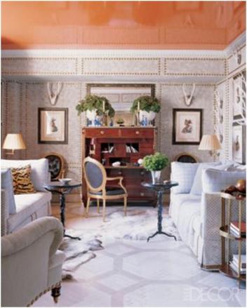
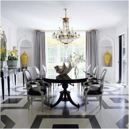
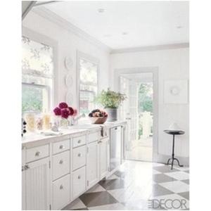
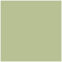
This may well be one of my favorites… likable enough for a large-scale piece of furniture like a sofa, or even an entire kitchen.
green-sofagreen-Kitchen
From House Beautiful.

Sweet Lilac… I like lilac for bedding in rooms where light blue or green is the primary color.

lilac-bedlight-purple-bed
From decodir and Traditional Home.

Driftwood… LOVE.pantone-driftwood-grey Where wouldn’t this work? But I must say right now I’m into deep grey sofas.
grey-sofa-living-roomgrey-sofa-living-room

Starfish…a medium brown. Pantone-starfish-brown 
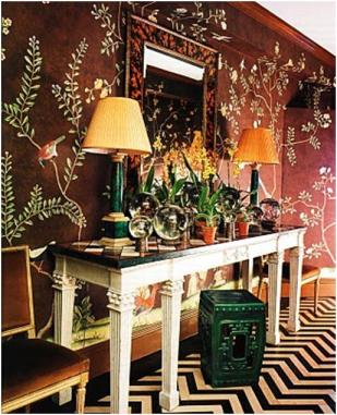
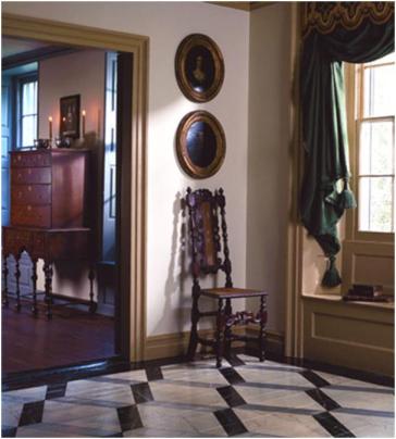
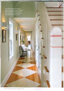
Love this as a backdrop in a small space, like a foyer.

starfish-brown-foyerbrown-foyer
Via homedit and House Beautiful.

Roomology’s inner Gamer comes out to play

Ever since the original Nintendo Gameboy came out (I mean the real original gray one) I was hooked on Tetris.  I have had that game on every computer and cell phone I have owned and even this year it was the first App I purchased on my iPhone.   As an homage to my favorite puzzle game I have collected some of the coolest Tetris home design pieces.

Brave Space DesignBrave Space Design - This shelf comes in color (as shown) or white. I can picture this in a playroom or any modern interior.

Brave Space Design - Tetris Bamboo Shelf for those inner geeks who are also eco-friendly.

Diego Silverio and Helder Filipov worked together on this collection. I'm sure you can find a use for any of these pieces.

 And of course we cannot leave out the mosaic tiles.  These tiles are offered in any color your little gamer heart may desire.  As a kitchen backsplash or accent tiles in a bathroom, Tetris inspired tiles could add that little something extra to take your room from average to awesome.

Another UK based company, T-Tiles gives you the option to customize the tiles for your specific needs.

Color Options - You can choose up to 7 colors and they will have your order shipped in 3-4 weeks.

Paolo Grasselli created the Fontana Forni Fireplace. I love how you can easily move it around because it runs on ethanol and even change the layout according to your own floor plan and needs.

Soner Ozenc's mirror is one of my favorite pieces I have found. I am now seriously considering this post-holiday purchase for myself. I found it on DaWanda which is UK based however they ship internationally!

How else could you use the Tetris motif in design?  And what other games would make an easy transition from your game system to your home design concept?

Roomology loves: kitchens where the upper and lower cabinets are two different colors

Yes, it’s true. I can no longer truly fall in love with a kitchen whose cabinets are only one color. I just can’t, after seeing so many beautiful kitchens where the upper cabinets are a different color than the lower. Check out some examples below:


My favorite combination: white upper cabinets and beige lower cabinets from Cottage Living.


A slightly more subtle shift from cream upper cabinets to light beige lower cabinets via
decorpad.


Another great combination: white upper cabinets and wood lower cabinets in Kitchens & Baths.


A white oven hood over dark wood cabinetry, from Southern Living.


White upper cabinets above lower cabinets in a fun blue shade in a country kitchen.


Above modern gray lower cabinets, white laminate upper cabinets make a white ceiling seem higher. From
Herron Horton Architects.


White upper cabinets and dark lower cabinets are joined by a geometric backsplash. From Real Living.


I love how this modern kitchen breaks with tradition in putting the darker colored cabinets on top, and the green trim around a few of the cabinets adds additional fun. From
Canadian House & Home.


Using darker cabinets on top can also work in a traditional design.


Roundup: Painted Wood Floors

I’m rather obsessed with painted hardwood floors (and by rather, I mean completely).  So I thought I’d do a roundup of painted wood floors in my four favorite patterns: checkerboard, stripes, chevron, and geometric.

CHECKERBOARD:

Grey and white checkerboard painted floor makes this kitchen cozy but unique. From Elle Décor.

This entry is so much more interesting with a wood and white checkerboard floor. From New England Home.

STRIPES:

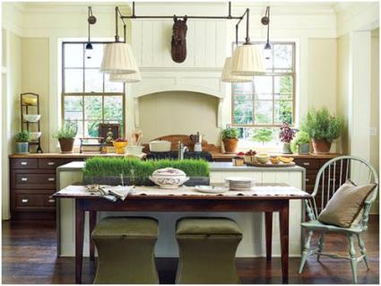
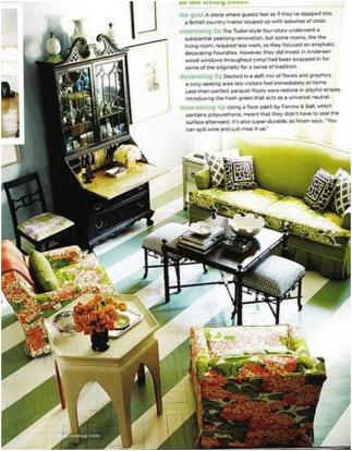
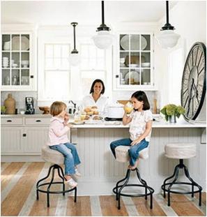
 White stripes liven up a wood kitchen floor. From Cottage Living.

Bold green and white stripes mask an old parquet floor. From Domino.

CHEVRON:

Chevron provides visual interest, even in the bath. From Mary McDonald.

Miles Redd’s chevron foyer from House Beautiful.

GEOMETRIC:

Designer Jeffrey Bilhuber’s subtle gray pattern is a great juxtaposition to the modern, glossy ceiling. From Elle Décor.

Mary McDonald is the queen of painted floors.

This home is rather traditional, but the bold geometric pattern could be used in more modern homes as well. From Old House Online.

Cream Cabinets with White Trim?

A friend of mine sent me the following question.  She has white crown molding throughout her house, but she decided to buy antique white (cream-colored) kitchen cabinets.  Then, when her painter got in there, she realized those off-white cabinets would be hanging right below that bright white crown molding.  What should she do, she asked?  Should she change the color of molding in the kitchen, although then it would be different from the molding in the rest of her house?  Or should she put up the two different shades of white so close to one another?

Well, I’m not sure who exactly came up with the rule that cream and white should not be matched together, but in my opinion, it doesn’t really exist (or shouldn’t exist), either in fashion or in interior design.  Here’s just a sampling of looks from runways that combine white with cream (from MaxMara, Celine, Dolce & Gabbana, and Polo).

Similarly, white trim is a great complement to cream cabinetry.  Check out these examples:

Now.  Suppose you don’t buy this.  You didn’t like these variations in white, and you don’t want to be constantly looking up thinking, these don’t match one another.  There is an alternative.  You could finish out your cabinetry with matching cornices, thus avoiding the question of crown molding altogether.  Then the entire wall would be one unified cream color.  Check out these examples:

Absolutely lovely!  And check out in the first example, how they add pieces over the windows to keep the trim going around the room at the same depth as the cabinetry.

A Splash of Color on a Rainy Day

When I first came across this room I could not pinpoint what it was exactly that caught my eye.  How could something so simple look so complex?  Then it hit me… that was exactly why it works so well.  This room was featured in July 2005 issue of  Elle Décor.  The painting above the sofa is by Squeak Carnwath and was clearly a large inspiration when designing the space.   The artist used simple shapes and text with bold colors against a neutral background.   I cannot help but think I would love nothing more than to grab a cup of coffee and attempt to figure out how the combination of all these components are so successful.  This same concept is applied throughout the space.  The walls and sofa are a perfect neutral backdrop for the bursts of colors provided by the ottoman and accessories.  The designer then took this one step further and used clean lines and basic forms for all the pieces in the room.  The sofa is contemporary with the hard angles and this is repeated in the ottoman and even the bright orange tray used to hold books and flowers.  Everything about this room works and shows us how simplicity can look so complex!